
Flat Lay Clothing Photography Ideas: 10 Practical Setups
Ten flat lay clothing photography ideas for backgrounds, folds, outfit layouts and spacing, with real before-and-after examples and accuracy checks.
Last updated:
Good flat lay clothing photography ideas help a shopper read the garment quickly. A pleasing arrangement is useful only if the neckline, silhouette and important product details remain clear. Start with a simple, repeatable catalog view, then make a second composition for a collection page or editorial post.
The ten ideas below work with a phone, a surface large enough for the garment and soft light. The embedded examples use this site’s existing AI-generated sample originals and model results. They illustrate layouts and conversion limits; they are not photographs of customer stock or proof that a generated result preserves every detail.
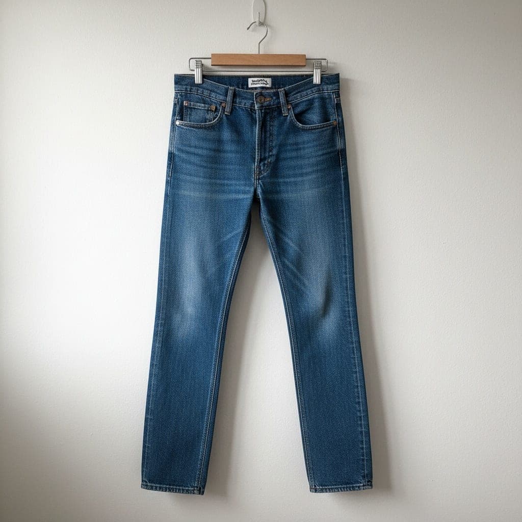
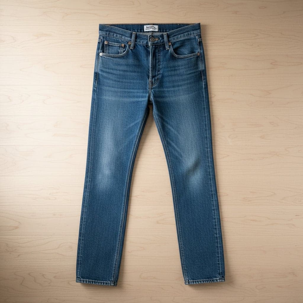
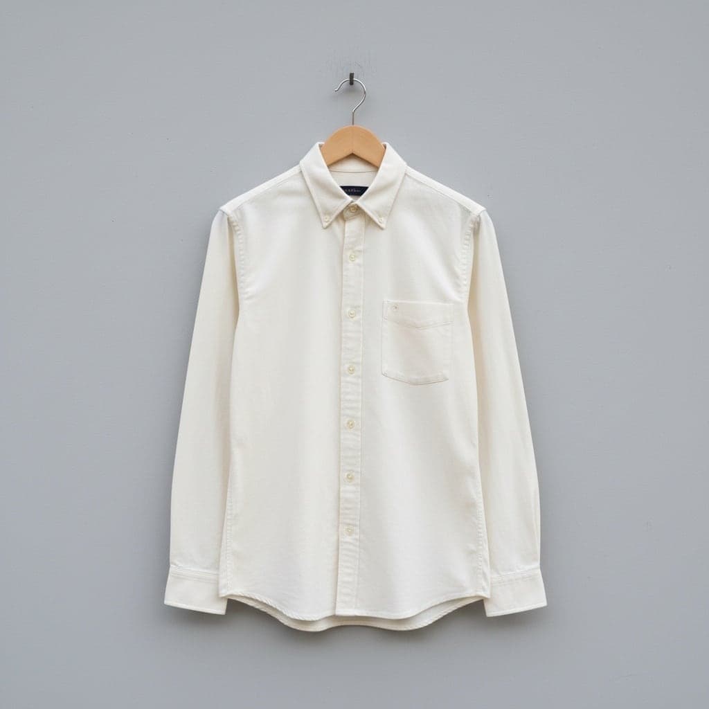
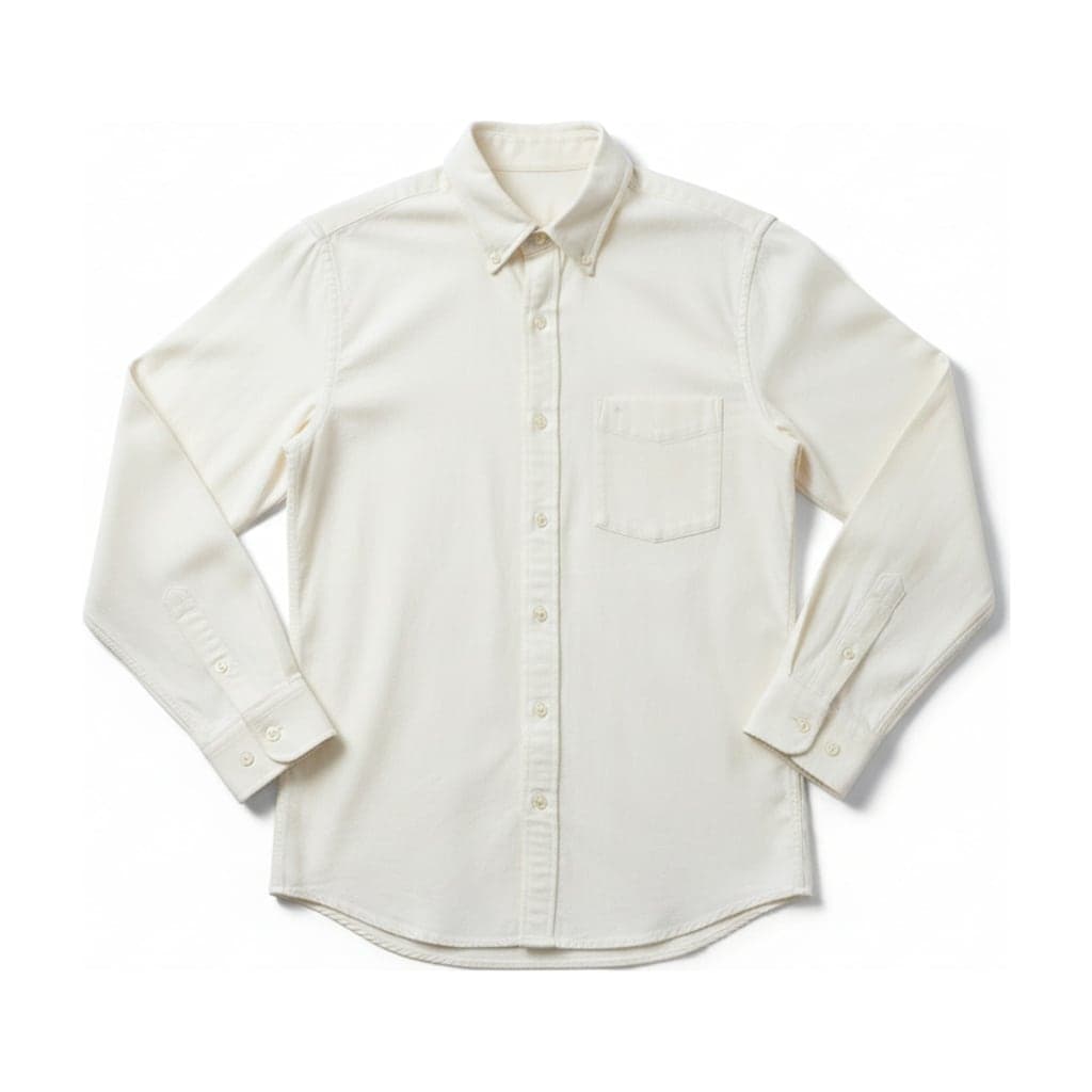
1. Start with a plain white catalog view
Place a single garment on a clean white surface and photograph it straight from above. Leave a margin on every side so sleeves and hems are not cut off. Smooth obvious creases without stretching the fabric, and keep both shoulders at the same height.
White helps you compare silhouettes across a collection. For white clothing, check that fabric texture remains visible rather than increasing exposure until everything disappears. If you use the flat lay generator, select a white background and check the edge against the input: a clean background is not evidence that every seam stayed unchanged.
 Hanger
 Flat lay
 Hanger
 Flat lay
2. Use linen as an editorial background
A tightly spread piece of linen gives a casual shirt or knit a restrained texture underneath it. Choose a neutral tone with enough contrast to separate the garment from the surface. Avoid a heavily crumpled background that creates shadows competing with sleeves and folds.
Photograph the surface and garment together when that material is part of your intended composition. Do not assume an AI conversion will retain the original background. Keep a plain-background catalog photo as well, since decorative surfaces can make color comparison harder and may not fit a marketplace’s image rules.
3. Match sleeve folds across similar products
Fold both long sleeves inward at matching angles, keeping the cuffs visible when they carry a selling detail. Repeat the fold on each color of the same style. A paper reference placed outside the frame can help you remember where the sleeve bends.
Avoid folds that make a sleeve look shorter or hide an unusual shape. Take an unfolded overview too when proportions matter. The purpose is orderly presentation, not disguising the product’s width or length. A generated flat lay may choose its own sleeve position, so inspect that choice before adopting it as a catalog standard.
4. Open a collar deliberately
Arrange a button-down collar so the opening reads clearly while the placket stays straight. Fasten the buttons you normally show in the listing and make the two collar sides balanced. Take a separate detail photo if the inner label or collar stitching matters.
Do not tug the collar into a shape the actual shirt cannot hold. With an AI conversion, inspect the neckline against both the source image and the garment. Hidden interior material can be drawn differently. That is a reason to keep a factual close-up, especially for branded or contrast-lined collars.
5. Build a simple two-piece outfit
Place a top above trousers or a skirt, with a small gap rather than overlap. Align their centers and leave enough space to see each hem. This reads as an outfit without implying that the products are physically connected or hiding the waistband.
Use a real photographed arrangement for multi-item editorial scenes. The generator is intended for a single garment; it should not be treated as an outfit compositor. If items are sold separately, make that clear in the listing and provide individual product views. Keep accessory shadows away from the clothing edges.
6. Leave space for an editorial caption
Move the garment slightly to one side and reserve an uncluttered area for text in a collection graphic. Photograph a little wider so you can crop for several placements without clipping the clothing. Keep the text outside the item rather than across the print or fabric.
Save this as an additional editorial image, alongside the neutral product overview. A marketplace main image may have restrictions on text or props, so check the platform’s current requirements. A composition that works for a store banner is not automatically suitable for every listing thumbnail.
7. Choose the crop before arranging a long garment
For a dress or pair of trousers, mark the intended portrait frame outside the photograph before laying it out. Put the full hem and waistband within that frame. Raise the camera sufficiently to use the main lens without tilting it toward one end.
A square crop can leave a long item tiny or cut it off. The tool’s aspect-ratio and padding settings can help standardize exported framing, but they do not add verified product detail. Compare the proportions after conversion, and make sure the longest edge still fits comfortably in the final view.
8. Show texture in a companion photograph
Keep the main flat lay easy to read, then take a close-up of knit stitches, denim weave or embroidery. Use the same lighting direction as the overview and focus on the fabric itself. Place a second detail shot beside the listing image rather than forcing every feature into one busy composition.
A generated overview can soften or reinterpret texture. Inspect the result at full size; a convincing thumbnail may conceal altered stitches. Real detail photographs give customers a more dependable view of construction. Do not use a generated texture close-up as a substitute for a feature your input never showed.
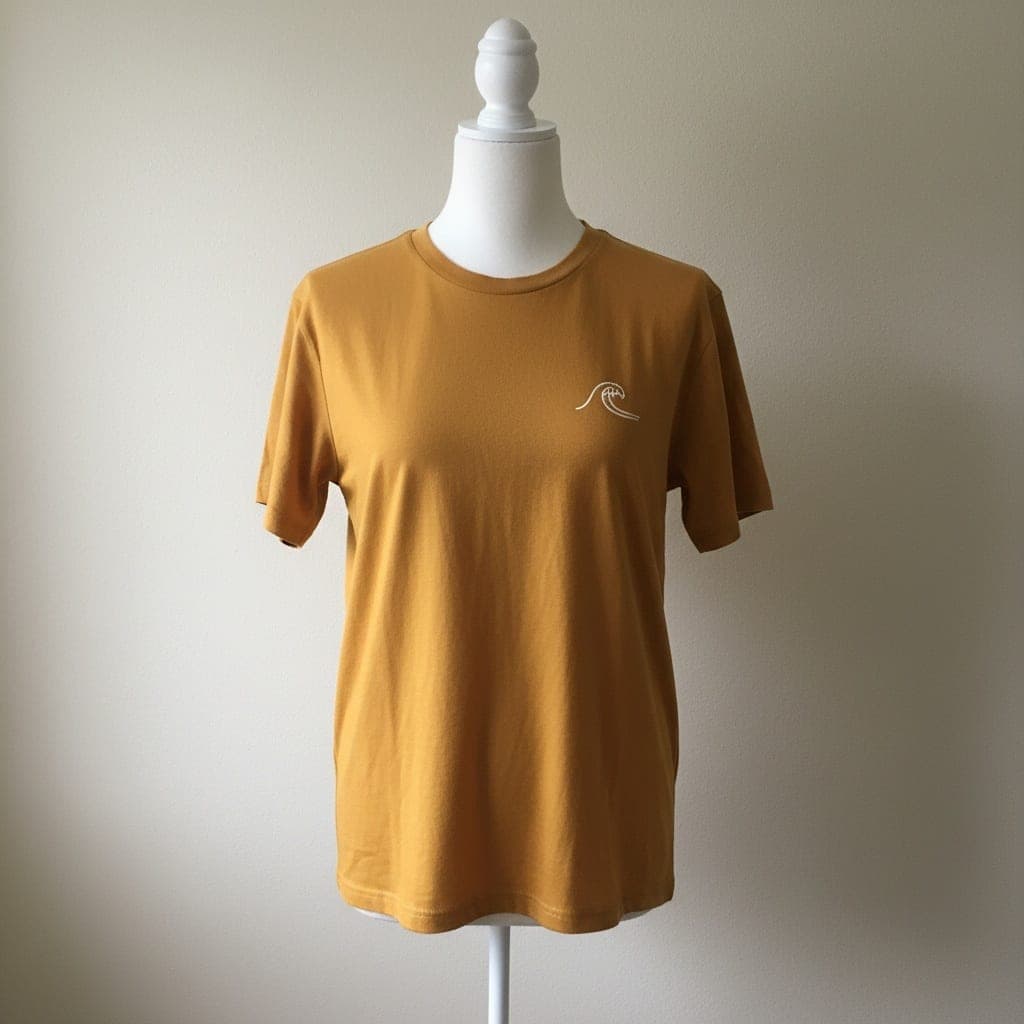 Mannequin
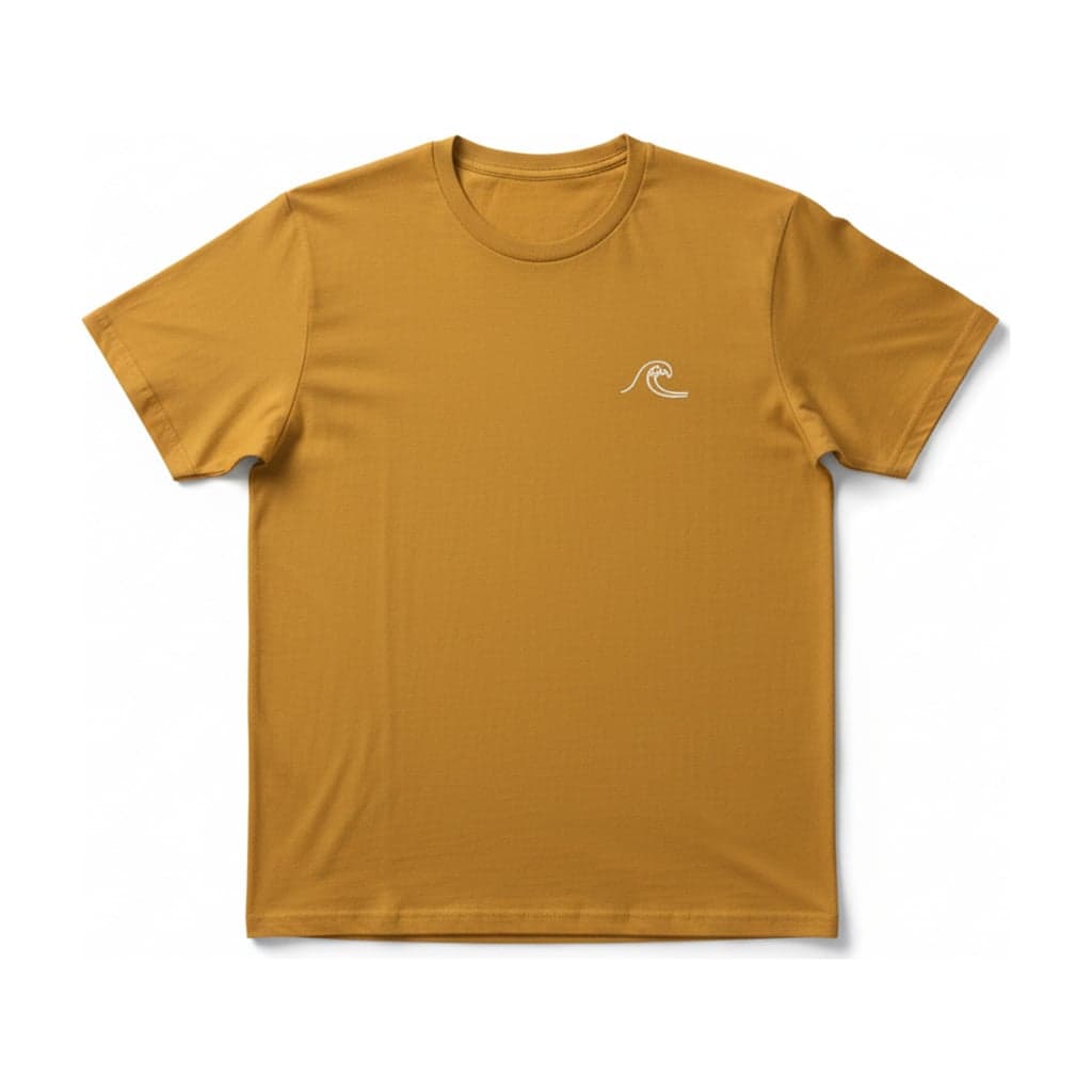 Flat lay
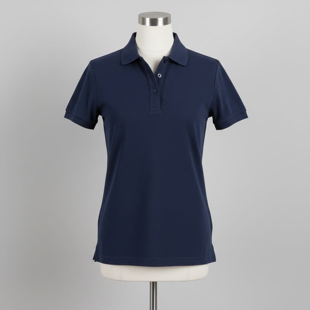 Mannequin
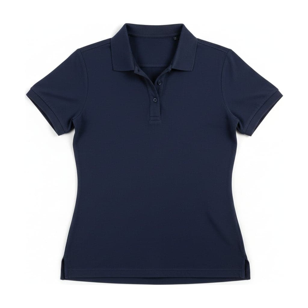 Flat lay
9. Repeat the same spacing across a collection
Keep the camera height, surface and garment margins consistent. Record where the neckline and bottom hem sit within the frame for each garment type. Review the images together as a contact sheet so differences in scale become obvious before publication.
Use separate references for short tops and long dresses rather than forcing every item to occupy the same exact height. Consistency means a readable system, not distorted proportions. When using generated outputs, repeat the settings and check that the model did not widen a body or shorten a sleeve to fit the composition.
10. Compare a flat view with a worn-looking view
A flat lay makes the shape and styling accessible; a ghost mannequin image emphasizes volume. Show both when they answer different questions about the same garment. Keep the lighting and background reasonably consistent so the shopper can compare the item itself.
The same-input P examples demonstrate this choice, including disclosed differences below each result. Use the ghost mannequin generator for a second presentation, then check both against the original. Neither generated view replaces measurements, a photographed detail or a worn photo when those are needed to explain fit.
Related reading
Follow the flat lay shooting guide for surface and lighting setup, check clothing image requirements, or compare ghost mannequin versus flat lay.